
INDUSTRY:
COMMUNITY
CLIENT:
PURPLE KULTURE
YEAR:
2025
EXPERIENCE:
EVENT BRANDING
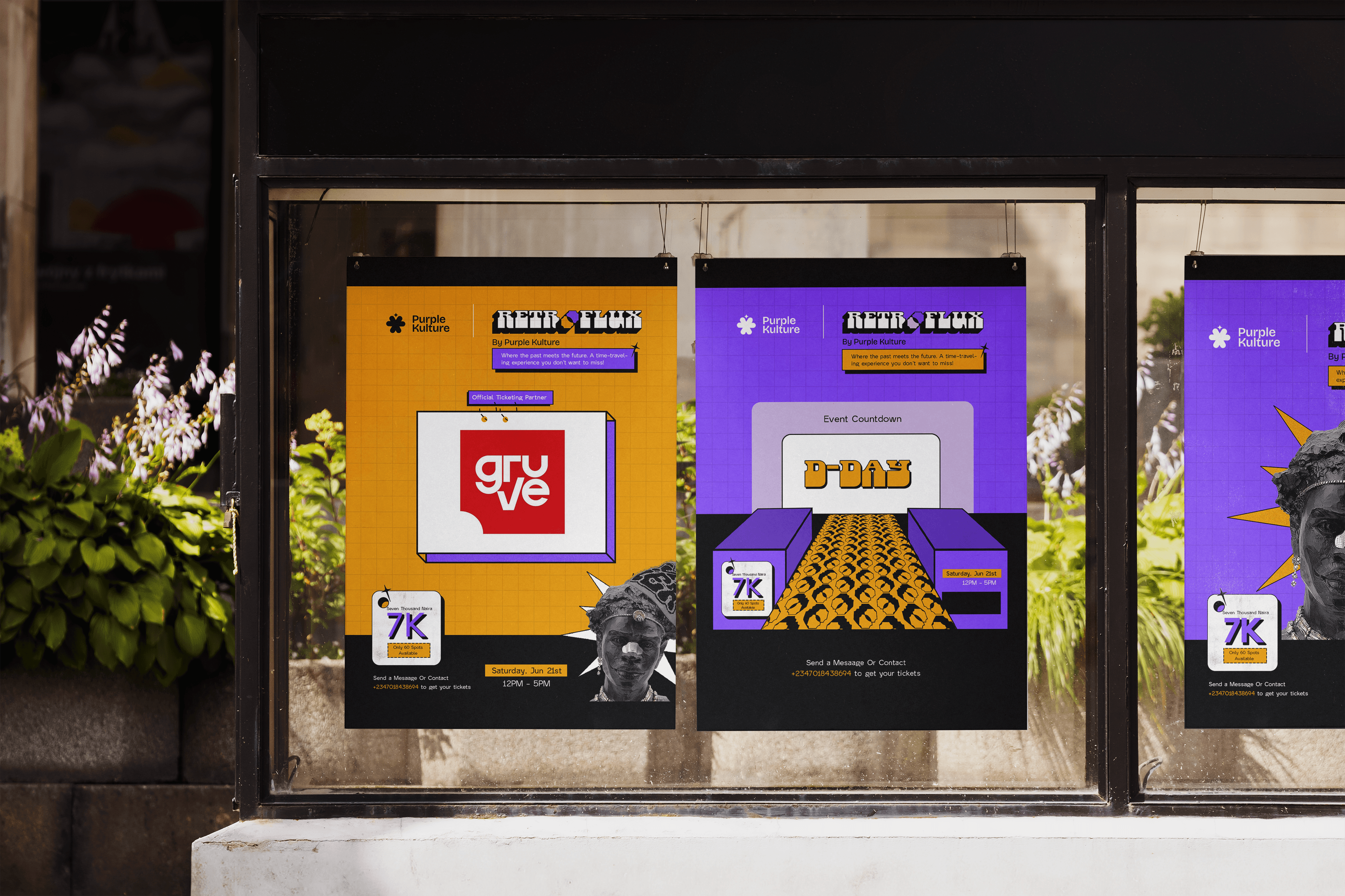
Retroflux 2025
about.
Retroflux is an annual event by Purple Kulture that celebrates the intersection of nostalgia and contemporary creative culture. The first edition revolved around a simple but ambitious theme:
"Where the past meets the future."
Rather than treating nostalgia as something to replicate, the goal was to reinterpret familiar visual languages through a modern lens, creating an event identity that felt immersive, energetic, and unmistakably contemporary.
The project involved developing a complete visual system that could live consistently across promotional graphics, countdown assets, tickets, sponsor materials, and event communications.
challenge.
The biggest challenge wasn't designing event flyers, it was translating an abstract concept into a cohesive visual language.
The event needed to communicate the collision of two seemingly opposite worlds: the familiarity and warmth of the past alongside the optimism and energy of the future. Leaning too heavily into vintage aesthetics risked making the event feel dated, while focusing only on futuristic visuals would lose the nostalgic character at the heart of the concept.
The identity also needed to remain flexible enough to work across multiple touchpoints while feeling immersive and instantly recognizable.

result.
The whole idea behind Retroflux was simple: what happens when the past and the future exist in the same space? Instead of making it look purely vintage or overly futuristic, I mixed both worlds together. Bold perspective layouts made everything feel like you were stepping into another dimension, while vintage-inspired type, grainy textures, graphic patterns, and a loud purple-and-orange colour palette gave the identity a nostalgic feel without making it look dated.
More than anything, I wanted Retroflux to feel like an experience before the event even started. So rather than designing a few nice-looking flyers, I built a visual language that carried across the countdown posts, tickets, sponsor graphics, and every other touchpoint. The result was an identity that felt playful, immersive, and memorable, while giving Retroflux a strong foundation that could evolve with a new theme every year.

Dewale is the kind of designer that you explain your concept to, and the rest is history. He totally gets it.

Christiana Jayeoba
Founder & CEO

